Playful Branding for Brine Time
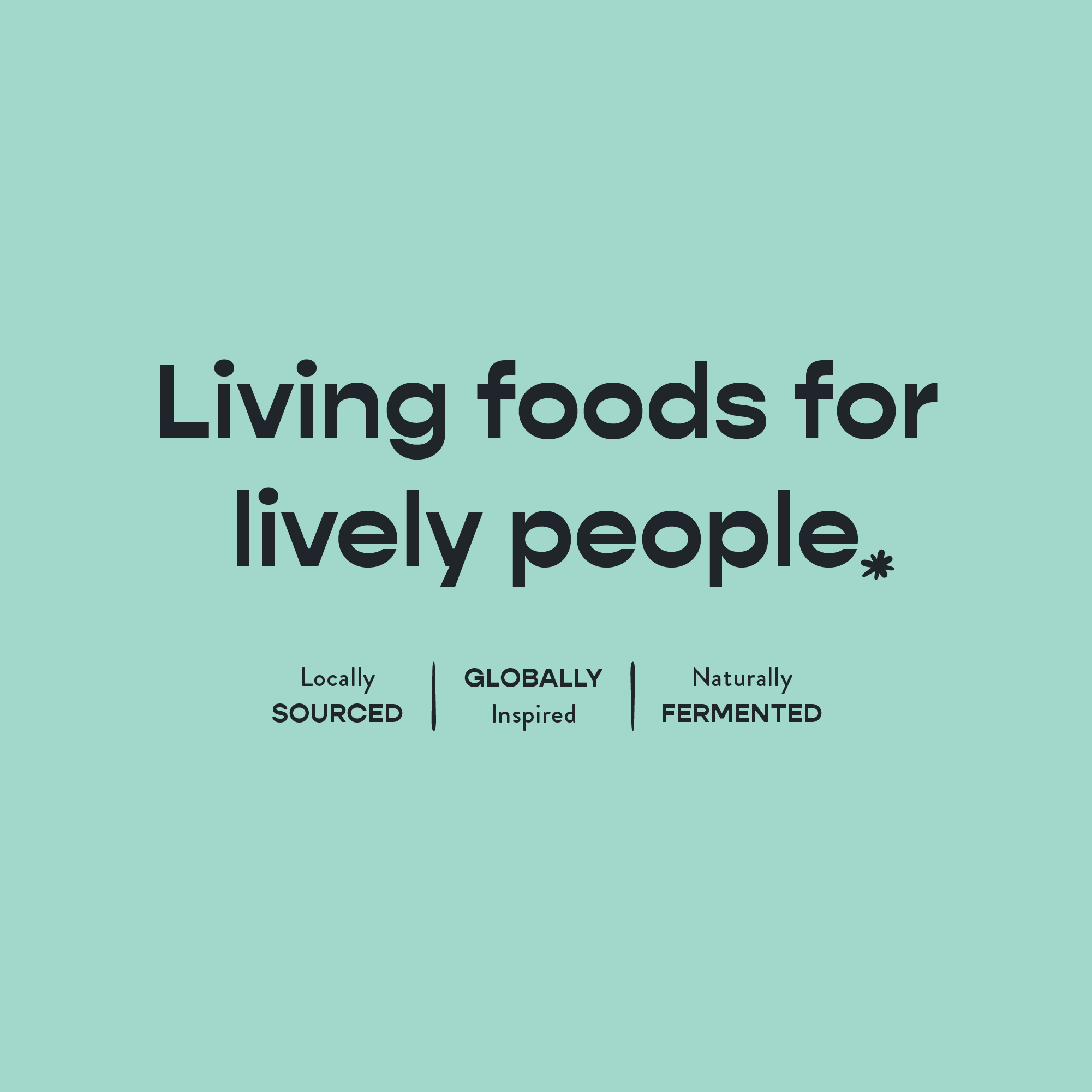
Living foods for lively people.
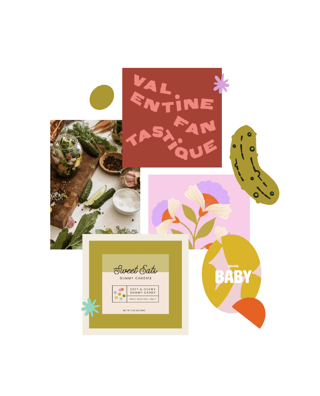
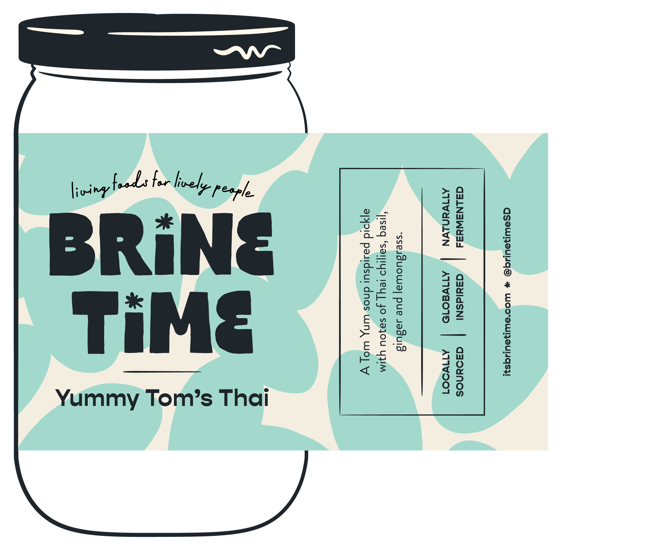
Brine Time wanted a brand refresh to elevate their business, attract more wholesale clients, and make a splash at their local farmer’s market. As we rebranded, we kept their ideal customer in mind—the adventurous foodie craving naturally fermented goodies for a more conscious diet. Each piece of the brand needed to reflect the meticulous care in local sourcing and natural fermentation while also highlighting their daring flavor combos. We mixed bold typography with vibrant colors and playful patterns to create a brand that's artisanal, approachable, and unmistakably bold. The result? A look that’s sure to turn heads and spark curiosity and flavor palates.
Services
Branding, Packaging,
Illustration, & Surface Pattern
Client
Brine Time
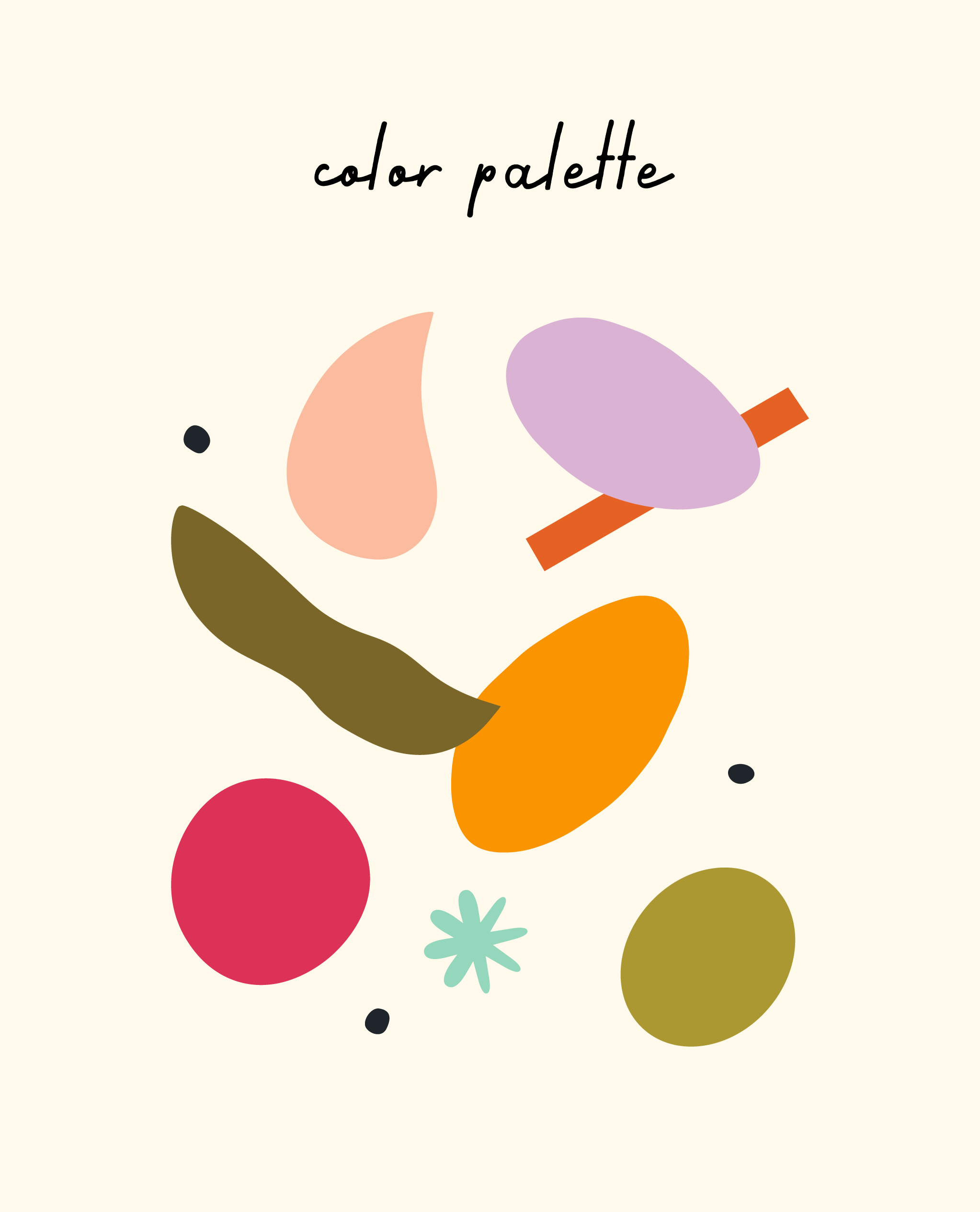
The Mood
colorful • approachable • fun • bold
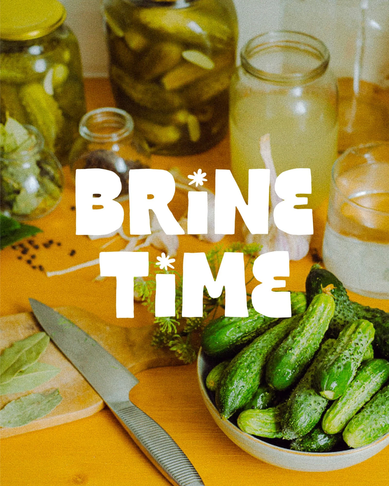


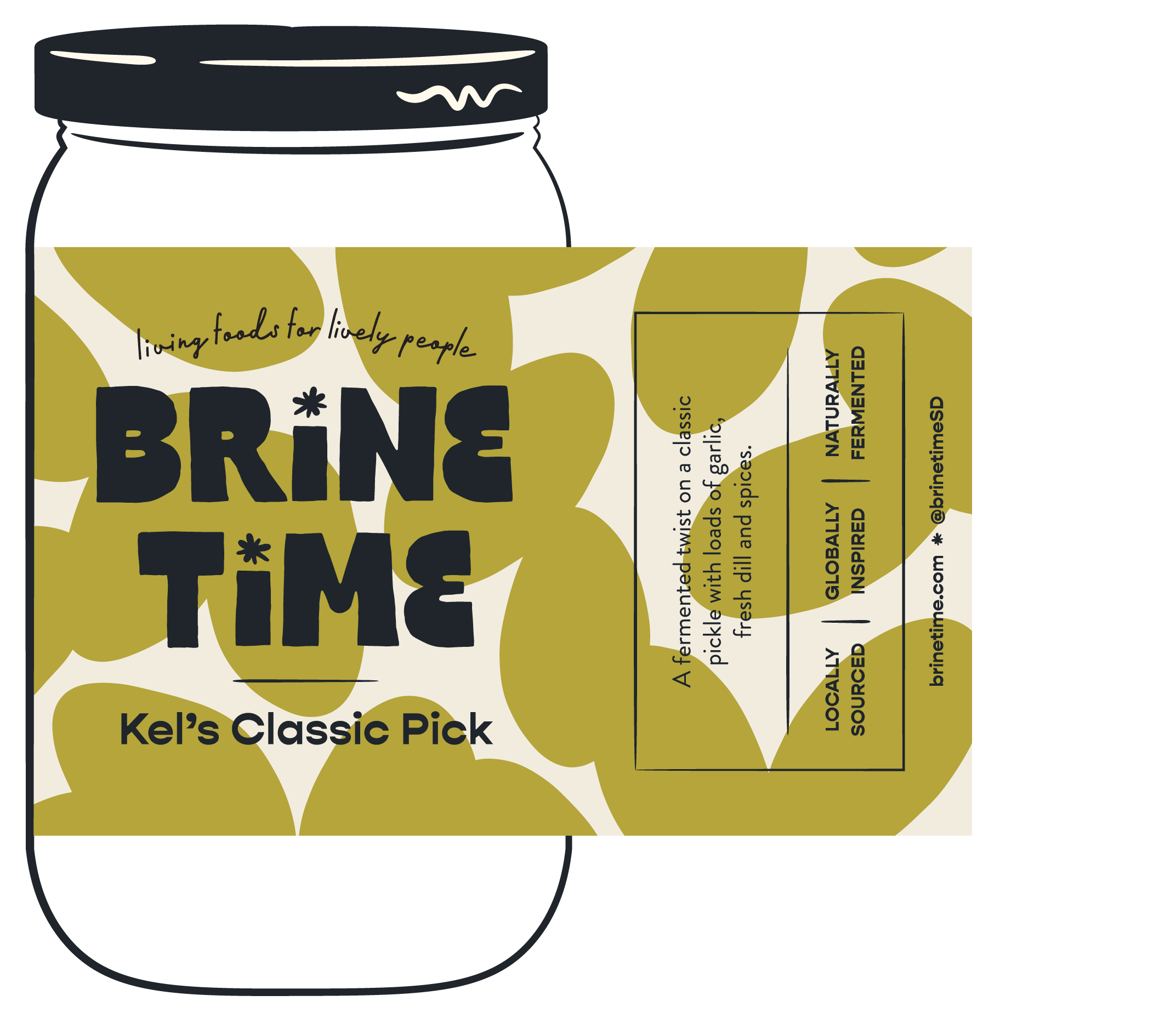
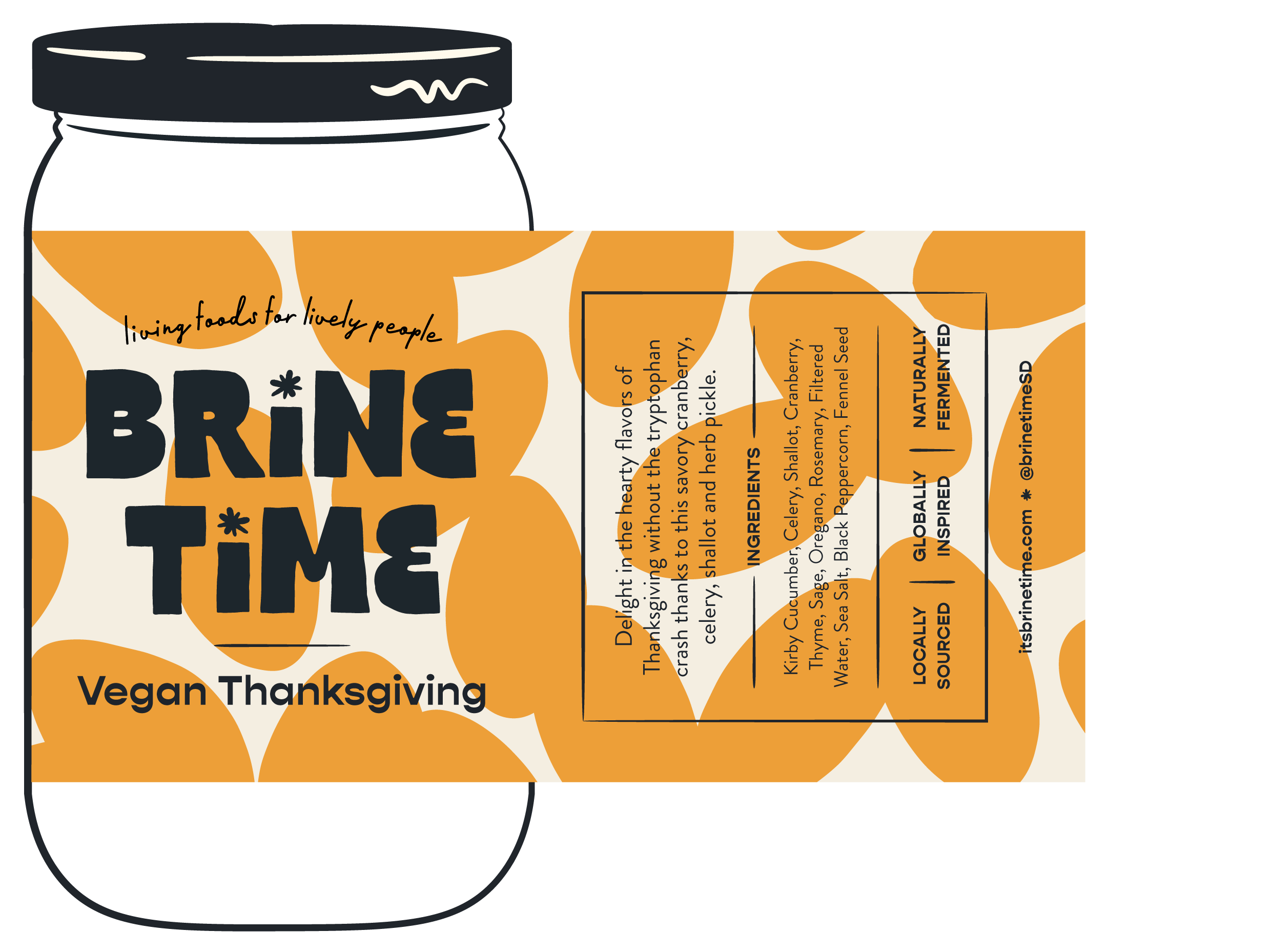
Label Design
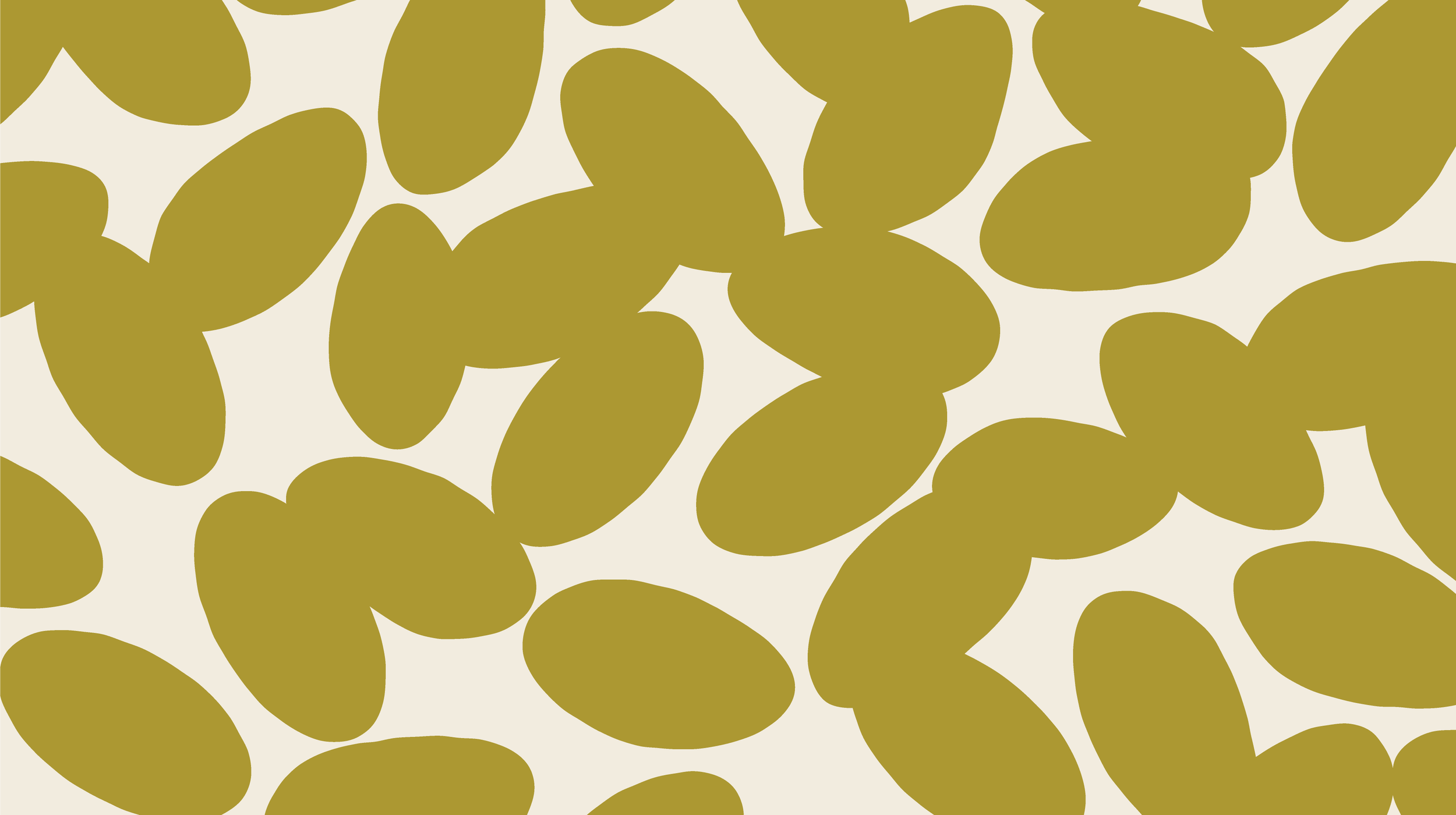
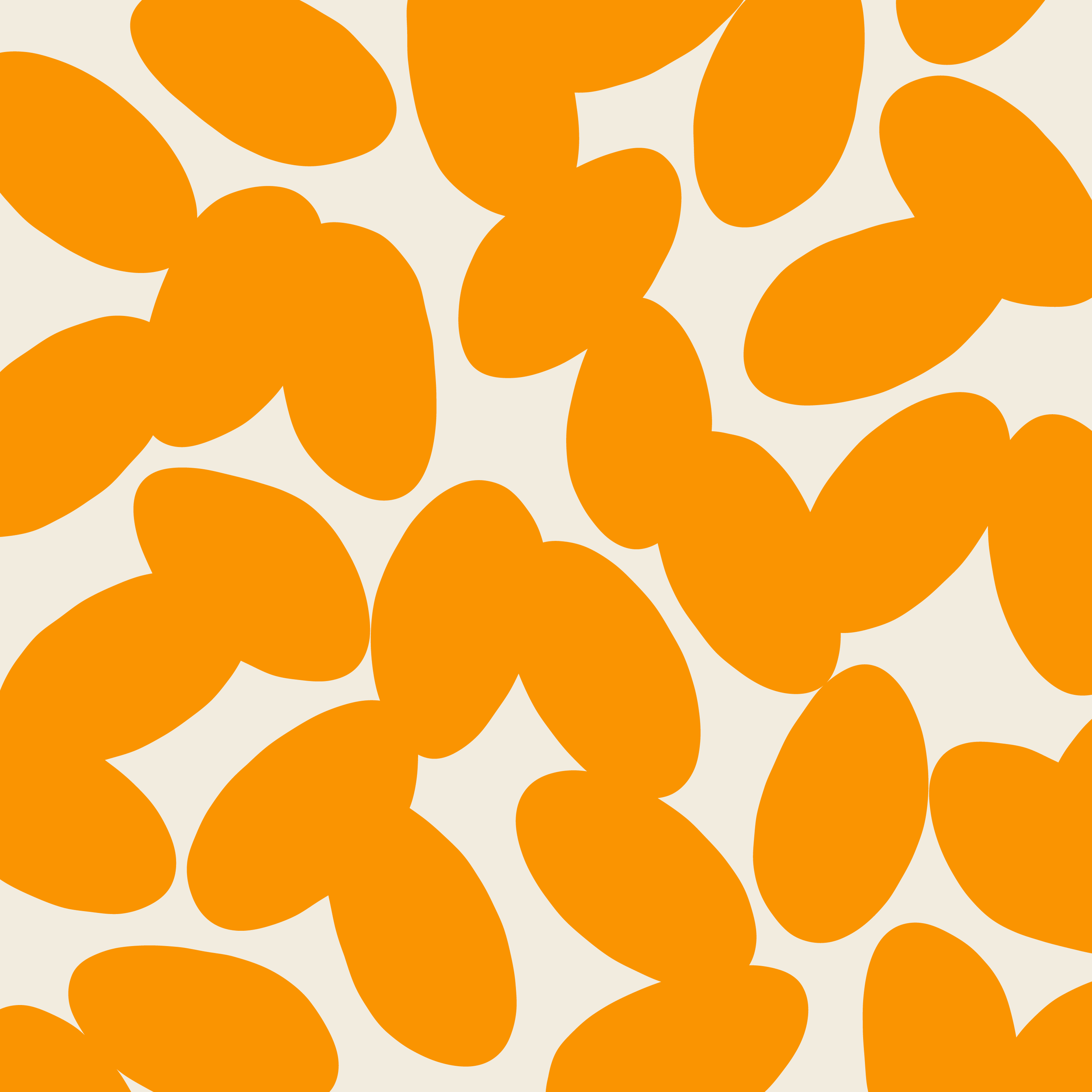
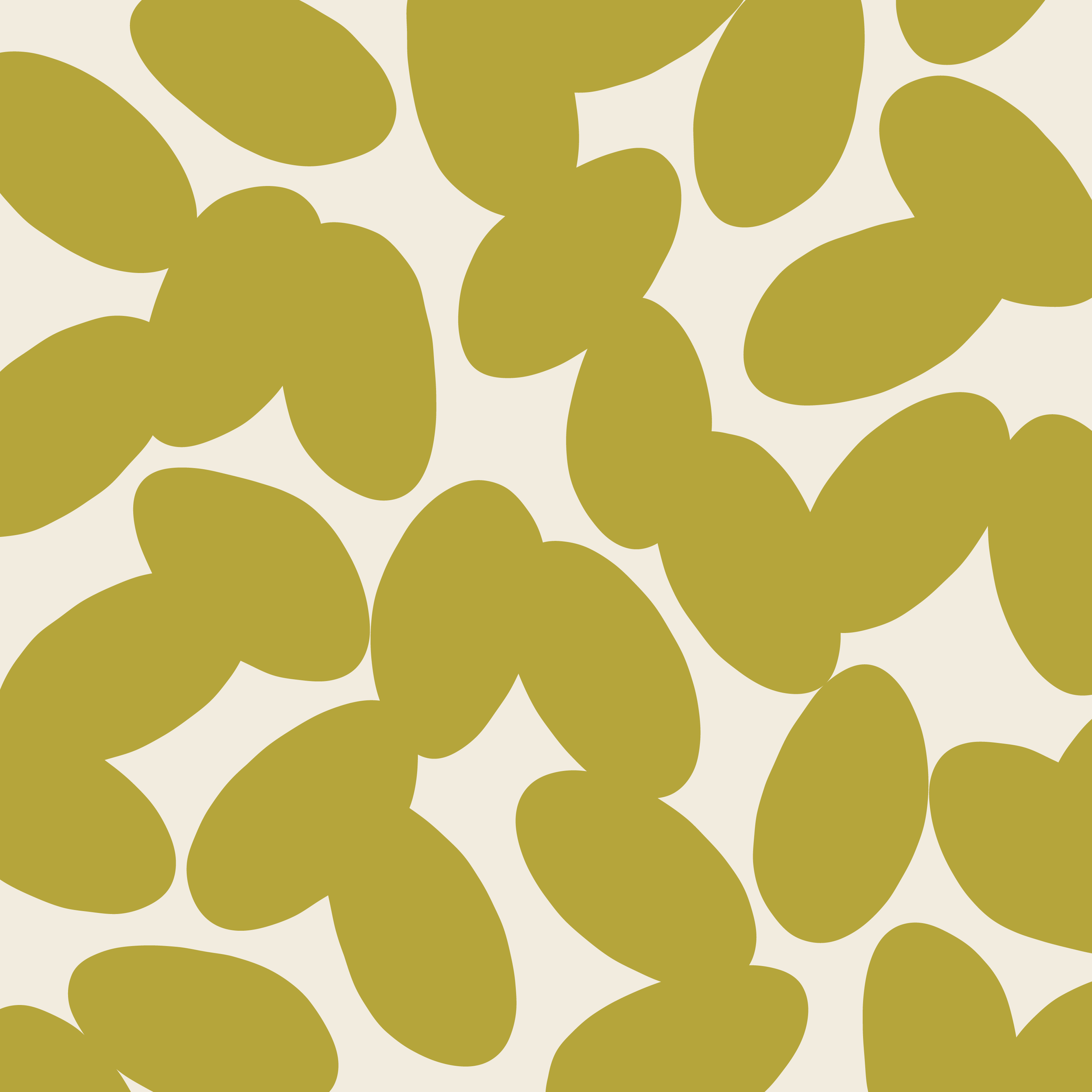
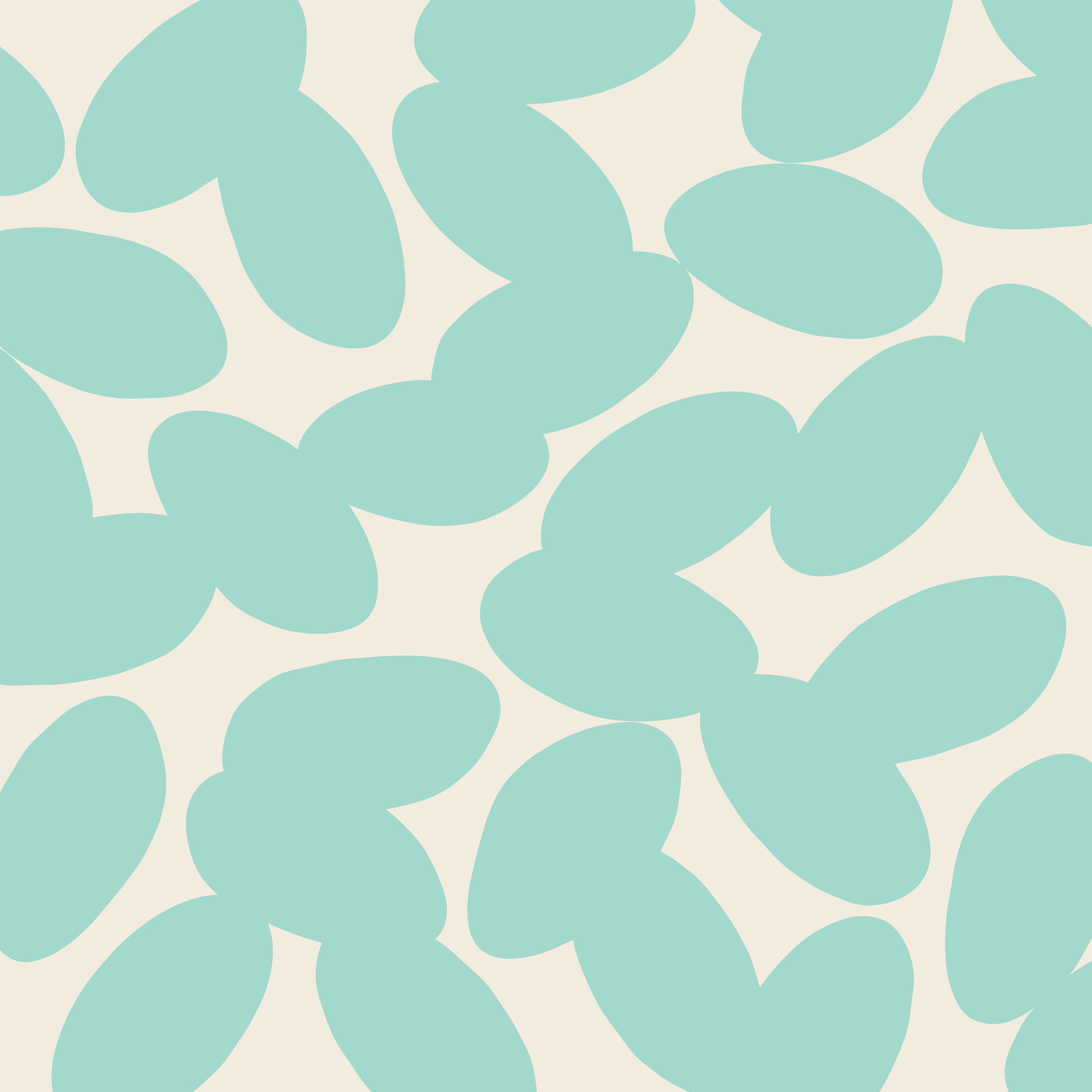
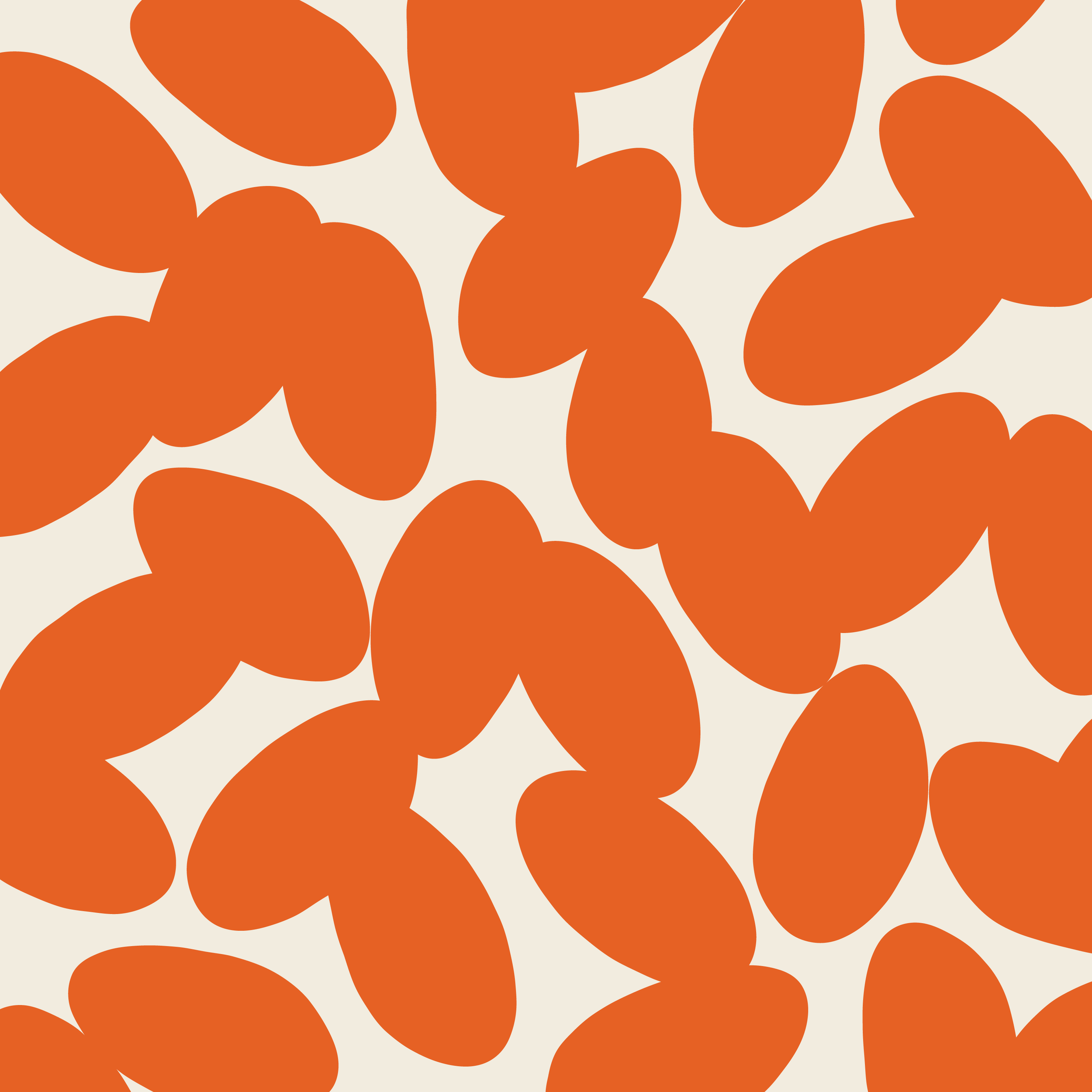
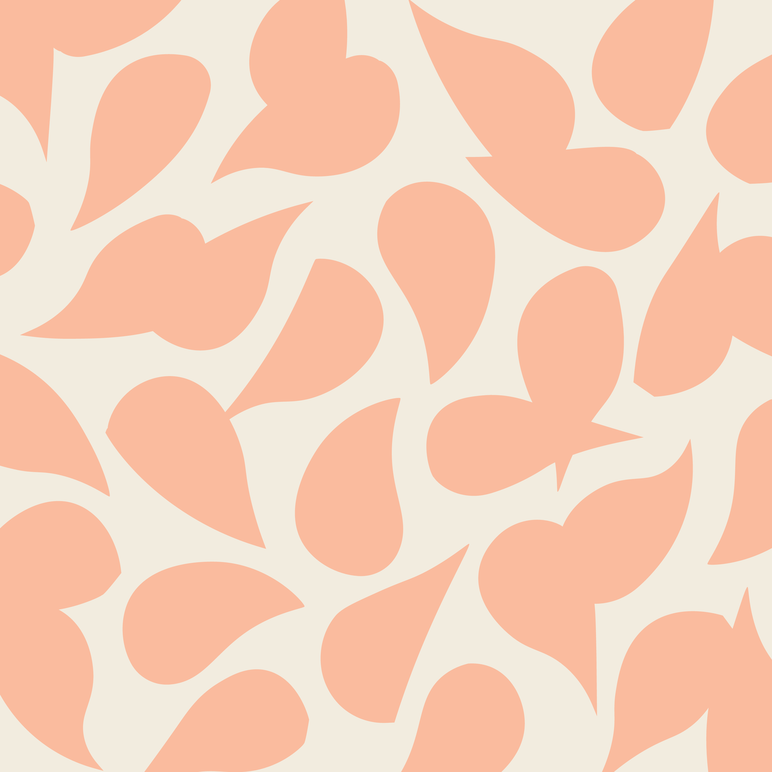
The labels are where all the magic happens, bringing together every element of the brand in a way that's truly eye-catching. Each one is graced with an abstract pattern, cleverly derived from the ingredients nestled inside the jar. Seasonal flavors and colors are introduced to keep the collection fresh and exciting.

Kind Words
“Working with Shelby was a dream. She helped bring my brand to life from both an aesthetic perspective and also in terms of positioning. She captured the unique point of view I was trying to convey and welcomed my feedback throughout the process. She is a talented artist and excellent communicator. I look forward to working with her for future business needs.” –Kelly S.
Illustrations


